
Looking Back at St.Joe Yearbooks (Part 2)
November 3, 2020
Compared to the Hi-Way yearbooks of the 50’s, 60’s, 70’s, and 80’s (as seen in part 1 of this series), the editions from the 1990’s and 2000’s are certainly very similar to what readers are used to in 2020. Yet there are still numerous differences from these older editions to our own. With this in mind, let’s take another look back at some of Saint Joseph’s many yearbooks of the past.
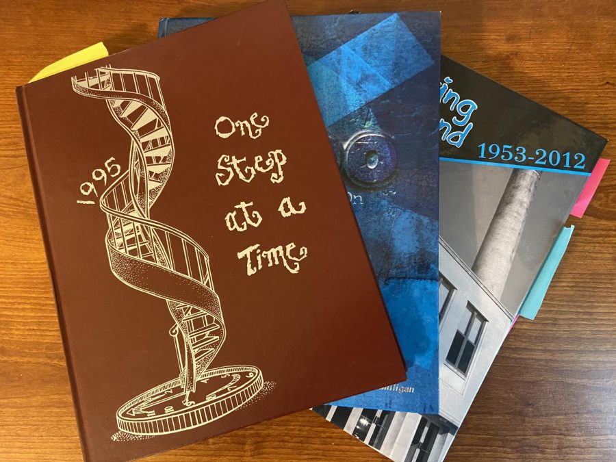
Much like the previous editions from part one, the covers of the yearbooks all are easily recognized as products of their era. The 1995 edition features artwork of a spiral staircase on top of a clock, with the caption “One step at a time”. This cover also features quite an… interesting font. 2000’s edition is far less subtle. There are images of a timer on the back cover, to represent the countdown to the new millennium, while the front features many hallmarks of early 2000’s design. This particular yearbook is titled “The Beat Goes On”. Finally, the 2012 book is far less of a product of the times, with the emphasis being on the closing high school building. The name given to it, “Breaking Ground” also shows the excitement of the new school building, referring to the ongoing construction of the new building, as seen on the back cover. Notably, this edition is the first one reviewed in this series that has a custom image for the cover, presumably made possible thanks to the rise of computer technology. Let’s now jump inside these three books, and further find similarities and differences with our own time.
The nine-year gap between the 1995 and 1986 editions is the second-smallest gap between editions in this series, and the similarities between the two are clear from the get-go. The look and feel of the yearbook is almost identical to the 86’ book, right down to a similar looking font package. Mostly, the difference is in the people spotlighted–the big hairstyles of the 80s are gone, and replaced with ones that wouldn’t seem all that out of place today. A big contrast from this edition and the previous yearbooks is the camera quality, as most of the school photos wouldn’t seem too out of place today, with the exception of a large difference in lighting techniques. The selection of extracurriculars also are extremely similar to today, with all of the major sports of today being present in 1995. Particularly interesting is lacrosse, which was described as a recently started program, and had to travel all over to play games due to a lack of programs. Most clubs are familiar to our own school today, but two notably absent from today’s list are Habitat for Humanity and Amnesty International. Both are global organizations that had branches at St. Joe, and focused on helping those in need, even outside the school or South Bend community. Spotlighted in the yearbook are efforts to build a house in Fort Wayne, and a letter-writing effort to the government of Israel. On a more school-wide scale, spirit week continued to be ever-popular, with a fall week and winter week. The fall week saw each class have one theme day, and a school-wide disco day on Friday. While seeing 70s nostalgia in a 90s yearbook is strange to say the least (especially after seeing the less-than optimistic view of the future portrayed in the actual 1970 yearbook), I’m sure a 90s themed day in today’s time would surely confuse our 2040s counterparts. A final interesting note is the presence of ads at the end of the yearbook.
While present in the 1986 edition, what makes these interesting is that some ads were taken out by individual families to celebrate their own children’s graduation. Overall, not much looks out of place or dated from this particular yearbook.
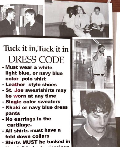
Any misconceptions about what year the next yearbook is from is immediately cleared up by the cover (blaring “2000” five separate times), but if that wasn’t good enough, the second celebrates the beginning of the millennium as well. This is unsurprisingly a running theme throughout the book, with this event only occurring every thousand years. Other elements of the time are peppered throughout the yearbook, including a blocky computer lab, several large yet high-tech for the time cell phones, and popular song lyrics and titles describing the extracurriculars of the school. These saw little change from the 1995 edition. One full page is notably devoted to the dress code, which seems quite similar to our own. However, a major difference is that “St Joe sweatshirts can be worn at any time”.
Perhaps the school should return to this way of thinking… Spirit week continued to be a highlight of the edition, with themes such as rock star day and bible character day, but most interesting about this spotlight is its title: “We’ve got spirit, yes we do!” Somehow, this chant has existed since the 20th century and shows no signs of slowing down at St. Joe. Much of this yearbook follows a similar pattern, with many familiar aspects of the school being present in our own time, with a few slight changes. The look, feel, building, and students may have changed, but the general experience is quite similar. One student’s name in particular is all over the pages–Peter Buttigieg is spotlighted for Amnesty International, student government, National Honors Society, and more, but I’m sure no one ever heard of him again. Altogether, the 2000 edition of the Hi-Way looks even more similar to our own (outside of a large amount of typos), which is a continuing trend as we move closer and closer to our time.
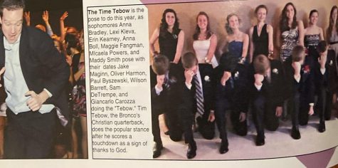
After looking at older, black and white, yearbooks for so long, the 2012 edition comes as a shock to the system. Bright graphics and many, many fonts adorn these pages. This presumably was made possible by the rise of computers. However, these new abilities to make the yearbook as contemporary as possible actually dates them even more, with the fonts and images used bringing back memories of the early 2010s. A more welcome improvement is once again the camera quality–thanks to digital cameras, virtually every single image in the yearbook is vastly improved from even their 2000 counterparts. This combined with the theme of looking back at the old building, gives us some of the best images of what life was like inside the old St. Joe structure. Although this yearbook is just eight years old at press time, the rapid changes of technology combined with the differences in buildings make this edition feel as far away as the likes of the other editions reviewed in this series. Once again, things seem similar but altered slightly, like almost all of the other copies of Hi-Way. Students still type away on certain objects, but instead of laptops or typewriters, its Windows 7-running pcs. Instead of referencing TikToks, 2012 had an inexplicable fascination with Tim Tebow. (Although many of the references in the 2019-20 yearbook will surely confuse readers in a few years).
At the end of the day, the 2012 yearbook bridges the gap between the schools perfectly. Much of what is familiar about St. Joe today is present, yet so much is different to the point where it feels like another era.
Although closer to our own time chronologically, the yearbooks reviewed here still feel like distant parts of another time. Our school advanced possibly more than it ever had in the past decade, and this is clear by simply glancing at the yearbooks mentioned here. Yet deeper looks prove that we are not too different from these days gone by, and nor will St. Joe ever be.